gone going
gone everything
-jack johnson
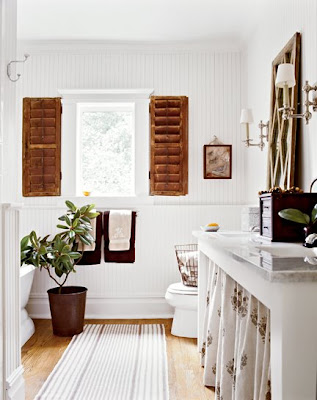
goodbye 14 wall street. hello 12 wall street. not a far move, but a move nonetheless. and if you've seen how much merchandise just 4 the home has, you know it's going to take more than a day to transform our space. but i can't tell you how excited i am to re-design the new space. it's going to be cleaner, more transitional, very classic, and easy on the eye. and did i mention our new design center in the back.
Tuesday, June 28, 2011
Monday, June 27, 2011
summer high.
is it me or does if FINALLY feel like summer. perhaps it's because my birthday is one week away. yes, yes i'm a yankee doodle baby, born on the fourth of july. but enough about me... here's some summery inspirations that will leave you feeling light and airy... and a little sunkissed.
elle decor - norway.
avant garde.
weafer design.
coastal living.
several interior design.
coastal living.
ocean styles.
Thursday, June 23, 2011
one two three floor.
have you been watching "million dollar decorator"? if you haven't, you're missing out. aside from completely relating to their celebrations, catastrophes, trials, and tribulations that accompanies the interior design industry, it's pure eye candy and absolute inspiration. in this week's episode, mary (my favorite) installed this floor for an office.
it got me inspired to check out other patterned floors that i want to use in future projects.
commonly used checkered floor, in a diamond layout.
herringbone styled wood floors.
stripes!
follow the yellow brick road?
the oval office in the white house. how trendy is our country!
black and white stripes...everywhere.
fun colors and pattern.
Tuesday, June 21, 2011
back to black.
you go back to her
and i go back to black
-amy winehouse
white walls with a black trim embody a level of sophistication and style unto its own. although it's uncommon from the lighter trim paint color that usually accompanies a room, it maintains an elegant look with an artsy spin. it adds a special detail to a room, highlighting the beauty in the woodwork and structure.
design crisis.
decorpad.
apartment therapy.
general remodel.
barrie briggs spang.
jessica claire.
brooklyn home company.
roman and williams.
Friday, June 17, 2011
that looks good.
that looks good but what's on the inside
what's on the other side? what's on the flip side
-living legends
i've always wanted to be involved with the packaging of products. ever since i saw heineken beers produced in the shape of mini kegs, i thought "now that's something i can have fun with." to be able to sit around a table with a bunch of creatives and brainstorm kitchy & fun ways to market a product. here's a few from I.D. Magazine Annual Design Review.
coca cola for summer.
Design firm: Turner Duckworth: London & San Francisco
Creative directors: David Turner and Bruce Duckworth
Design director: Sarah Moffat
Designers: Rebecca Williams, Josh Michels
Account director: Jessica Rogers
home depot gift certificates.
Designers: Josh Nelson, Julia Warren
Project team: Howard Harmer, Greg Hahn
wine packaging. love the number of the bottle over the number of bottles made.
Designer: Susanne Pierce Maddux
kleenex for the summer.
Creative director: Christine Mau
Designer: Jen Brock
Illustrator: Hiroko Sanders
Client: Kleenex® Brand
simple packaging for a simple product. tear here.
Designer: Aaron Tang
Additional credits: John Chuang, CEO at litl; Abbott Miller and Jeremy Hoffman of Pentagram
amazon.
Design: Lab 126 Industrial Design Team
Thursday, June 16, 2011
move over paint.
another brick in the wall
-pink floyd
move over paint. wallpaper is back. and with a vengeance. i recently posted on different style textured wallpapers which can make a room look so chic. but wait til you see these fantastically fabulous wallpapers, designed by tracy kendall. she sure knows how to make wallpaper into art.
fork. knife. spoon.
textured gold sequins.
textured fringe.
text.
feather.
lace.
textured paper.
pockets throughout the wall.
more books. all styles.
Tuesday, June 14, 2011
papa was a rolling stone.
papa was a rolling stone
wherever he laid his hat was his home
-the temptations
we're living in the age of the metrosexual man. and with his desire to look good in a physical sense, it's also his desire for his home to look good. more often than not, whenever i meet a guy and tell him what i do, his response is, "you might find this surprising, but i really like interior design." of course you do :)
keep this in mind with father's day coming up. there are a lot of interior gifts out there that a man might enjoy.
for the peaceful guy
for the working guy
for the drinking guy
side note: happy father's day to the best dad ever!
Subscribe to:
Posts (Atom)


